Creating Websites, Handling Negative Posts, and Wrapping Up the Semester
When promoting yourself, what is the easiest way you can think of for someone to get the full picture of what you are capable of? How about a resume, a portfolio, or preferably both? While controlling what you post on social media, creating an online personal learning network, and creating a professional portfolio can be created with the help of a variety of programs and concepts that have been discussed in blogs thus far, one of the most powerful professional tools is a website. Creating a website allows you to promote yourself in ways that other programs and digital projects cannot, in the sense that everything you would want a professional contact to know about you can be made available in an easy to access and streamlined format.
Creating Websites:
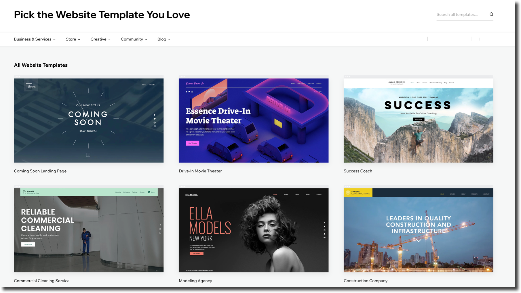
The first step to creating a killer personal website is the idea of deciding how that website is going to be created digitally. If you are like me (and many other professionals from different backgrounds), computer programming and coding are not a part of your perfected skills. This should not discourage you from creating a website though, as many companies and software developers have created templates and software (those of which are available free and paid online) to make the website creation process easy and doable by just about anyone.
While the ease with which one can access a website creator tool is convenient, that can often mean the options can seem a bit overwhelming. There are countless different website developers and programs that are popular online, but a select few have stood out amongst the crowd in their creation and design capabilities. Some of the most popular site builders include Site123, Squarespace, Wix, Weebly, and Xara. All of these website builders provide templates to which the user can drag and drop their desired files and applications. Site123 is seen by many as the easiest web design app for beginners as the commands to add and change the design of the site through labeled tabs are extremely similar. Wix and Weebly are strictly made for websites that can be more informational or commerce-based websites and are some of the more well-known website designers to date. Xara is similar to Wix and Weebly but less well-known and makes it even easier to access free stock photos that can be used on a website (arguably one of the hardest things to do when using Wix and Weebly). Squarespace is the most expensive of these 5 options, as it is only free for a maximum of 14 days and a plan must be purchased to have your creation go live on the web. However, all of these programs are known for their ease of use.
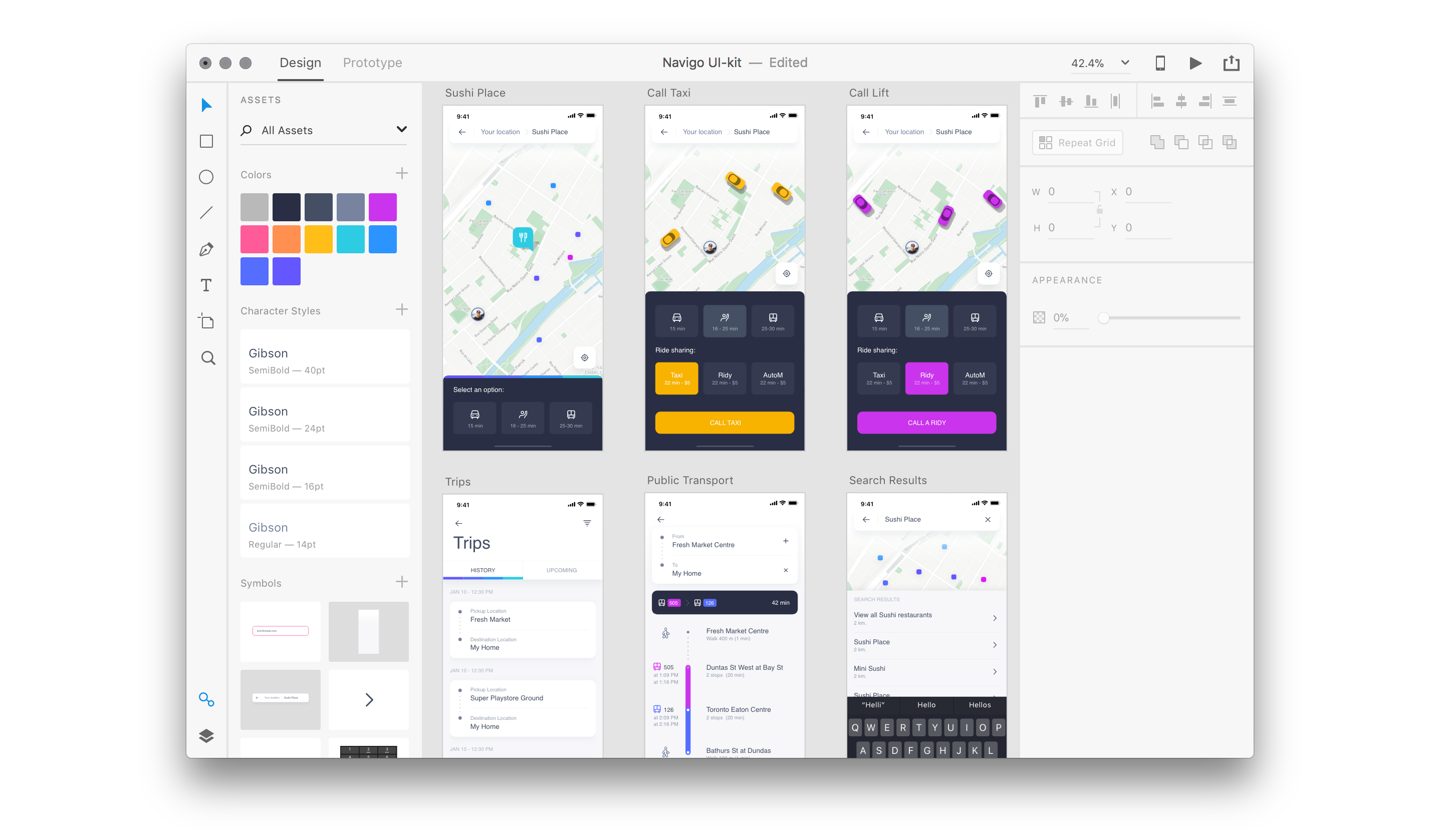
Other options listed as some of the best software options include Unbounce, Adobe Dreamweaver, and Adobe XD. Unbounce is geared the most toward e-commerce and marketing tools and has even more advanced design and font tools, but is also only available for free for 14 days. Adobe Dreamweaver is the least accessible of the listed options, as it requires a small percent of knowledge about coding, but allows easy transfer of files from other Adobe apps. Adobe XD, however, is more similar to the first 5 software described, and can even be used by two creators at once to create other digital creations in addition to regular websites such as games and apps.
For my personal portfolio website, after careful consideration and trying a few other options, I chose Wix and began creating my website. I chose Wix mainly because I preferred the look and design of their templates compared to the other more basic designs available on Google Sites, Weebly, and many others. Other sites had some decent options for design templates, but I wanted to make sure I chose something that was not overly flashy and could be easily changed as I move throughout my college career and gain more experience. I also made the final choice to use Wix over the other options because of its large range of apps that can be easily added to my website, as I knew I needed many different ways to display my content on my page.
Now, imagine you have decided to build a website of your own to promote yourself. You have chosen one of the many website building softwares available, and are now working on the actual content of your website and are faced with the main question of "what should you include on a website all about yourself?". One of the most important aspects of any self-promotion page is the "About Me" page. An About Me is one of the best ways to make sure whoever is visiting your website is not only met with facts about your accomplishments and serious matters but is able to see who you really are as a person and view your professional life in a somewhat more personal light.
To show off your personality and keep your visitors engaged, it is important to answer 3 questions on your page: "Who am I?", "What can I do for you, the visitor?", and "How can I be contacted?". Answering these questions for those who traffic your website is imperative, as it allows them to feel connected in a way that is not overwhelming with information but allows them to connect to your accomplishments and personalities while allowing your communication lines to be easily accessed to make connections.
While the main portion of your "About Me" page is written, the photos you choose to include of yourself are also extremely important. While professional photos are important, your personality should also shine through in portions of your website that connect to your everyday personality. However, your personality photos should connect somehow to your professional image, as if they do not connect at all, they may seem out of place if these connections are not made. Your about me page should is also a great way for you to show off your most professionally flattering posts, as they can help promote other parts of your professional digital profile that you already created. Being sure to include posts that are professionally driven is also imperative to making sure you are not trying to seem ingenuine.
Finally, arguably the most important part of your "About Me" page is the creation of an indented listing (or an indented heading shown on Google searches). Provided it is one of the top 10 search results on Google (as that is the only way in which an indented listing is shown on Google), this simple line of text allows you to make your website seem more official and make it even more likely that people will be drawn to click on your website. When creating my own webpage, I made sure to include my "About Me" page and all of the aforementioned aspects in order to increase the traffic and usability of my site for all of my visitors. I also made sure to include professionally appropriate photos along with a professional photo of myself to create the image of myself that I would want any contact to see.
While making sure your desktop website is correctly formatted and easy on the eyes is one aspect of making sure your portfolio website is the best it can possibly be, making sure that the mobile version of that site is intact is also extremely important. With internet use around the world rising and mobile devices (such as smartphones, tablets, etc.) becoming more accessible to people all across the world, being able to connect with people through your website in a mobile format is extremely important in order to bring in more people to your site who could be potential professional contacts. Mobile websites that work correctly and are visually appealing are only going up in monetary value, as they can make companies that have them a great deal of money, only further proving their worth.
Even in places where desktop computers are more accessible, having a good mobile site ensures that everyone who visits your site is getting the best possible experience. This includes making sure your website loads fast and is visually appealing in mobile format, making the website appealing to visit for everyone. The better the user experience, the more likely a user would be willing to work with that person professionally. In my website creating experience, I focused a great deal on the creation and design of my mobile version of my website for this specific reason. I made sure to keep everything simple, yet make sure all of the necessary professional information was included.
Chapter 8, "Light, Bright, and Polite for Professionals
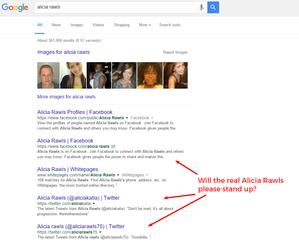
In Chapter 8 of "Light, Bright, and Polite", author Josh Ochs explains how to deal with negative posts in continuation of his discussion on how to create the best online image possible for yourself. He gives examples of not only the types of negative posts that you might not directly cause (such as others posting things you would not have posted yourself, people with your same name posting things that do not represent you, and/or a lack of posts on social media in general), but ways to fix those digital mishaps. For example, Ochs gives the advice of politely yet directly addressing those who post unwanted pictures of you without your consent, as the only way they are going to be able to know that you would like those photos taken down.
In addition, Ochs also harps on the idea on making sure you have a good idea of what your online profile looks like to others. Knowing this can give you an idea of how to combat the causes of undesirable posts made online by others with the same name and make sure that your online profile reflects who you want to be known as professionally and personally. Having a good understanding of both of these ideas is imperative to making new positive posts that can move the negative posts made down the Google search list, and make your ideal digital professional persona a reality. He even promotes his tool called the "Footprint Friday Tool" as a way to check your Google search results Personally, I know that I will be checking up on my Google search results using his tool and my own methods as I will be a professional in four short years. Though that seems like a lot of time, I know that I can use those 4 years to put myself ahead of the game for gaining internships and eventually a great job in the Nursing field.
Semester Wrap-Up:
In September 2021, I began this blog as a part of my Freshman writing class for Stockton University; "GEN2243: Exploring Your Digital Portfolio". If I am being honest, I was not sure what to expect from the course going into it, but I am so happy that I decided to follow my gut and stick with my first choice. Throughout this course, I have learned so much about what a Professional Learning Network really is (and how to build one), how to use tools like Twitter, Blogging, and LinkedIn to make yourself more presentable to future connections and employers, and even current educational connections. I also learned a lot about writing in both the more relaxed style of a blog and the more rigid style of APA; the latter of which I know will be very helpful throughout my college career.
Throughout all of my assignments, our class discussions, and the amazing opportunities we have had to have new experiences (such as using the Oculus with our AR/VR lesson, which was one of my favorite parts of this class) and to be able to speak with professionals from all different backgrounds have all taught me so much about the digital world. Even when we approached a topic in class that I already had a background on (such as LinkedIn or Digital Citizenship), I found myself learning so much about how these ideas can be applied to my future professional work. One of the most important lessons I think I learned all semester is the idea of social media etiquette, as while many of the social media mishaps investigated should have been clearly wrong to post, a professional understanding of how to deal with these situations and how to avoid making them myself I know will make me a better person and nursing professional in my later points in life. Overall, I am so thankful to have been a part of this course especially in my Freshman year of college and thank you to Professor Calderwood for making this semester so memorable.
Final Thoughts:
Overall, a personal website can be the perfect culminating piece of a personal learning network. Being sure to include the right aspects, use the right designs, and make sure the site is usable on all platforms is imperative to making the best website possible. Furthermore, Chapter 8 of Josh Ochs' book shows examples of how to overcome negative online images that are often out of your control and make the most of what you want to be.


/how-to-write-about-me-page-examples-4142367-FINAL-ff212f14c0294f2b962695ff84455890.png)


Hey Erin, I liked your blog as you talked about the different steps to creating a website along with listing off a few sites that would potentially help with specific needs. I also liked how you incorporated the semester wrap-up by explaining your experience with the class and how you've managed it.
ReplyDeleteHi Erin, this was a great blog! I really like how you covered most if not all the important topics we have covered this semester and how they tie into your future career. Great Job!
ReplyDelete